Overdoing it
 Zach Waugh •
It’s easy to do too much with your app. Much easier than doing too little. It takes restraint and focus to pare down the features to just what the user needs to achieve their goal. If you’re not constantly mindful of this, you just starting throwing every feature you think a user might want, and the user experience suffers.
Here’s an example. There is a nice social network for reading called Goodreads. You can add books to read, see what your friends are reading, keep a history of books you’ve read, etc. I haven’t used it all that much, so I recently wanted to turn off my email notifications, and this is what I saw:
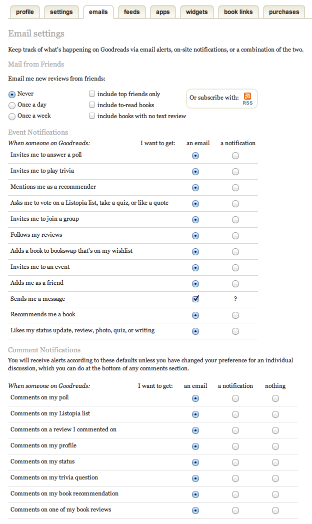
Good lord. I don’t know where to start on that, and that’s not even all of it. I’ve left out about 300 pixels at the bottom, and every settings tab has just about as much info. I just want to disable email alerts, I don’t want to spend all afternoon in there. The very least this screen could do would be a single checkbox that said “I’d like to receive email notifications”. That would have been fine with me. Maybe I would think I want some more options, but in reality, I’d much rather not have the choice. So many apps make things more complex than they need to be, because they think it’s what users want or need, but you can always get away with doing less.