Encouraging feedback from your users
I love hearing feedback from my users. I would love to hear every detail about what they love, hate, or want in my apps. But that’s not always so easy to come by. The users that really care about the app, or are really opinionated, will find a way to express their opinion to you.
But there is a large number of users that would probably give you feedback if it was simple and immediate right when they’re experiencing an issue, or have a suggestion for improvement. You might assume that a user will dig through your site to find your contact form or email address, and take the time to write a thoughtful email, but you’d be wrong.
Here’s two examples of apps that do it right in my opinion. I’ve sent both of them feedback 2 or 3 times, where most sites I never do.
Gimmebar
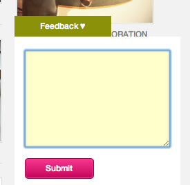
Gimmebar is one of my favorite new apps. I’ve been using to save design inspiration for the last month or so. They use what is now a bit of a standard for getting feedback — a tab fixed to the left, right, or bottom of the window. What they do differently is using a custom form for feedback that only has a text box, that’s it.

I want the least resistance as possible, and Gimmebar nails it. You really can’t make it any simpler than that. The GetSatisfaction/UserVoice style feedback boxes feel like too much work to me. A bunch of fields and options, to get my feedback into a system to be rated and commented upon. For the most part, I’m not looking to participate in your product’s development, I just want to send feedback, what you do with it after is up to you.
Gaug.es
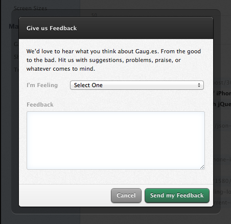
I’ve just recently started using Gaug.es, but so far it’s a really nice product. They have a fairly standard feedback box, simple and well designed.

Though I’d prefer they ditch the “I’m Feeling” drop down, as I’ve never been a fan of that idea. Feels more like a chore to sort out my emotional state on a minor display bug. If a user can’t find their emotion, they’re likely just to give up.
What they get right is that the feedback link is in their main navigation. That tells me it’s important to them, and not something they just threw in there at the last minute. They put thought into where it should go, and decided to put in front and center.

The most important thing
What they both get right is the most important thing. Both sites responded, and quickly, to everything I’ve submitted. It doesn’t matter how nice your feedback process is if it goes into a black hole.
It’s a little harder to get feedback in a desktop app, but I’m working on taking my own advice and finding an easier way to get feedback in my Mac apps.
 Zach Waugh •