The difference between Apple and everyone else
Every time Apple releases a new product, it becomes more and more clear that no other company really gets it. The next war for winning consumers’ hearts - in both hardware and software - will not be based on tech specs, but on usability and user experience. Computers are already way faster than the majority of people need. Things like the iPhone and iPad don’t even mention specs like processor speed or RAM anymore because it really doesn’t matter. What matters is the experience. Apple understands this, and has been growing by leaps and bounds the last few years because this is what they do best.
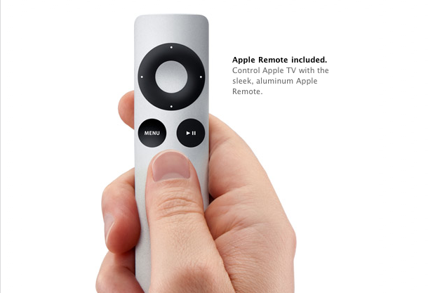
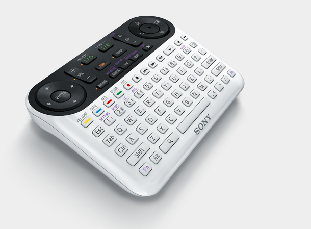
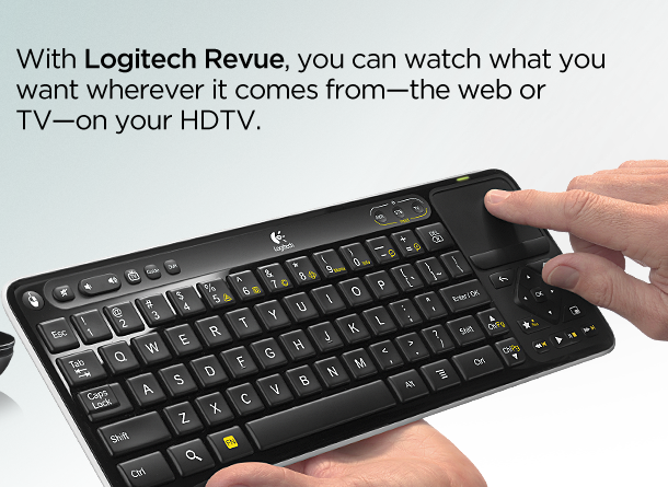
Take for example the difference in the remotes between the Apple TV and Google TV:

Apple TV remote. A simple 6-button remote that's easy to use and hold. Even if you weren't sure what each button does, you could figure it in a few seconds.

Sony - Google TV remote. A monstrosity of a remote, jam packed with a ton of buttons and full qwerty keyboard. This remote looks like it can fly a RC helicopter and should also print labels. I can't imagine that it's intuitive, even for the techiest folk among us.

Logitech - Google TV remote. A desktop-size keyboard with built-in track pad. Even in the staged photo, it looks awkward to hold and use. 80% of it's size is the keyboard though you probably only use that about 5% of the time. Also, I have no idea why you would build anything remotely resembling a mouse-driven interface for this kind of device.
The designers of the Google TV remotes seem to be just trying to shove a keyboard and mouse into a different package. I haven’t used a Google TV, but based on these remotes, I would bet the rest of the interface is just as clunky.
On the other hand, I can see the Apple designers starting from scratch, sitting down on their couches in their living rooms and imagining what they would want to use. What would be comfortable to hold in your hand while flipping through apps/channels? Can I easily perform the basic functions with one hand? What would you want sitting on your coffee table? Would you feel comfortable tossing the remote across the room? You know, real-world usability testing.
This kind of design thinking seems so basic, I don’t understand how no other company1 can get it.
1 Of course I'm generalizing here. Apple isn't the only company to get it. Lot's of other companies do, but just not any of the big players. Boxee for example, is another player in the set-top box space, and they seem to get it as well.
 Zach Waugh •